Hi, I'm Francis Nguyen
I'm a Computer Science PhD Candidate at the University of British Columbia where I am advised by Professor Tamara Munzner.
Papers
Average estimates in line graphs are biased toward areas of higher variability
Dominik Moritz, Lace M. Padilla, Francis Nguyen, and Steven L. Franconeri
InfoVis 2023 • Best paper honorable mention
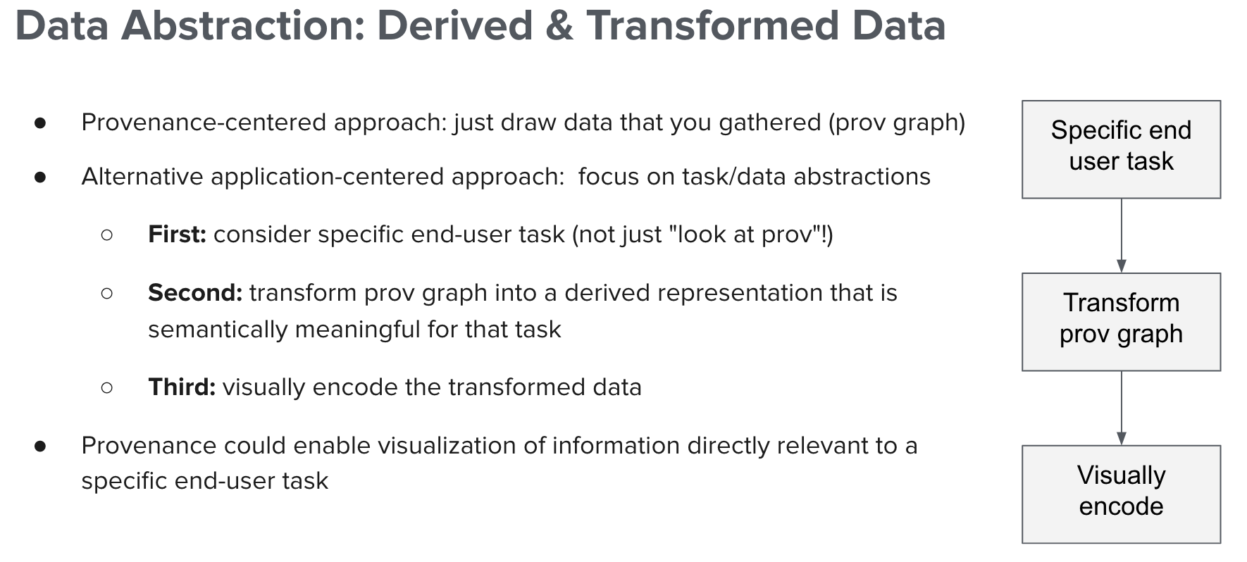
→The Value of Data Abstraction and Transformation of Provenance Data for Visual Analysis
Francis Nguyen, Jude Shamsi, Joseph Wonsil, Shabab Khan, Margo Seltzer, Tamara Munzner
ProvViz 2021
→Exploring the Effects of Aggregation Choices on Untrained Visualization Users' Generalizations from Data
Francis Nguyen, Xiaoli Qiao, Jeffrey Heer, Jessica Hullman
Computer Graphics Forum 2020
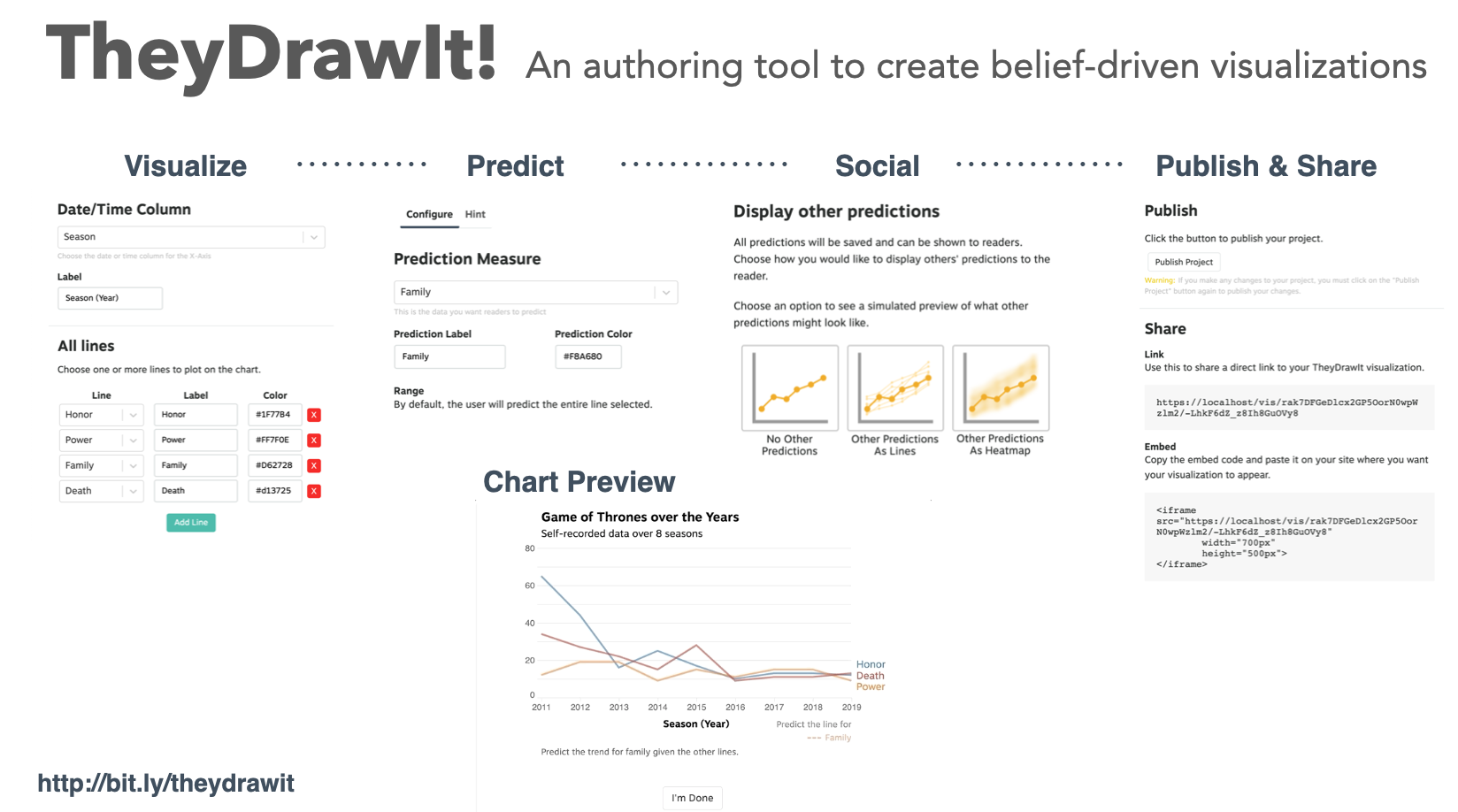
→Belief Driven Data-Journalism
Francis Nguyen, Samana Shrestha, Joe Germuska, Yea-Seul Kim, Jessica Hullman
Computation + Journalism Symposium 2019
→
Hypothetical outcome plots help untrained observers judge trends in ambiguous data
Alex Kale, Francis Nguyen, Matthew Kay, Jessica Hullman
InfoVis 2018
→Improving comprehension of measurements using concrete re-expression strategies
Jessica Hullman, Yea-Seul Kim, Francis Nguyen, Lauren Speers, Maneesh Agrawala
CHI 2018
A Google Chrome extension that leverages cognitive cartography and creates personalized spatial analogies of unfamiliar distances, areas and locations.
→Atlas of Me
design • development
A Google Chrome extension that leverages cognitive cartography and creates personalized spatial analogies of unfamiliar distances, areas and locations.
→Hi, I'm Francis Nguyen
I'm a Computer Science PhD Candidate at the University of British Columbia where I am advised by Professor Tamara Munzner. I am member of InfoVis group at UBC and the Design for People initiative at UBC.
My research interests rest at the confluence of information visualization, human-computer interaction, and systems. Particularly, I'm interested in data provenance and its broad uses in visualization and HCI. I'm currently working on domain applications of visualization utilziing data provenance in security, software learning, and reproducibility. I also have an ongoing interest in the power of design spaces and frameworks in HCI research.
I enjoy rock climbing, cooking, and learning about coffee.
- Fiorino
- TY Pizza
- Sushi Hil
- Pizza Coming Soon

Radius
Building a concept re-branding of a familiar 90's children toy. UI-Engineering for a re-design of Skip-it for highly athletic young adults.
About
Process

Oblige
Conceiving a new brand and experience to a clothing designer.
About
Oblige is a clothing, accessory and experience design company based out of Seattle. Shortly after finding a manufacturer in Seattle and releasing a soft opening of their first product, the Tourne jacket, Oblige reached out to me to help them build an online web presense. I worked with them to develop and deploy an online shop and website as their main online touch point with customers to experience the brand and the products.




Various shots with the signature Tourne jacket.
Building Oblige
I discussed with one of the co-founders what they wanted the brand to exude. After seeing the jacket and some ideas for branding, we decided on sleekness, elegance, and inspiration. Using the jacket as a focal point, we choose to use a monochrome palette, thinking that accented hues would detract from the all-black products. Leveraging social media, word of mouth and FOMO to drive traffic to the website, the site was designed mobile first, relying entirely on scroll for the user to navigate through different images. The site was built to feature one product at a time, to focus on the high-quality, elegant feel of each individual product's design.

Choosing to build the page from the ground up, with minor plugins, I hosted the service on a Digital Ocean droplet, and leveraged some basic jQuery and HTML/SASS to put the site together, as I wanted to reduce load time as much as possible. For the carousel, I used a lightweight library called Sly.js, and utilized some basic scroll throttling from Underscore. For the same reason of keeping load time as low as possible, I chose to use SVGs and their correlating animations and transitions for many icons due to their lightweight file size. As to not utilize potentially laggy animations, I built out each SVG animation with CSS transitions and animations over JS based ones. The animations and motion design was configured in such a way to be as clean as possible, while still providing context to navigate from the splash page to the product product.



Placeholder site and banner before official site launch.
Spacewar 2015
Making a live, multi-player game with Socket.IO where players navigate around a gravity well and try to shoot down other players.
20XX: Space Wars
In a future where dueling spaceships is a hobby... just kidding! Space Wars was originally a vintage vector graphics arcade game released in the 1970's. The game featured two players navigating a black screen, “space”, while attempting to shoot the other down with bullets. The main catch was a “star” in the middle, gravitating both players and bullets alike into the central black hole where they disappeared. As a result, players had to strategically aim and time shots as well as navigate around the star to hit their opponent.
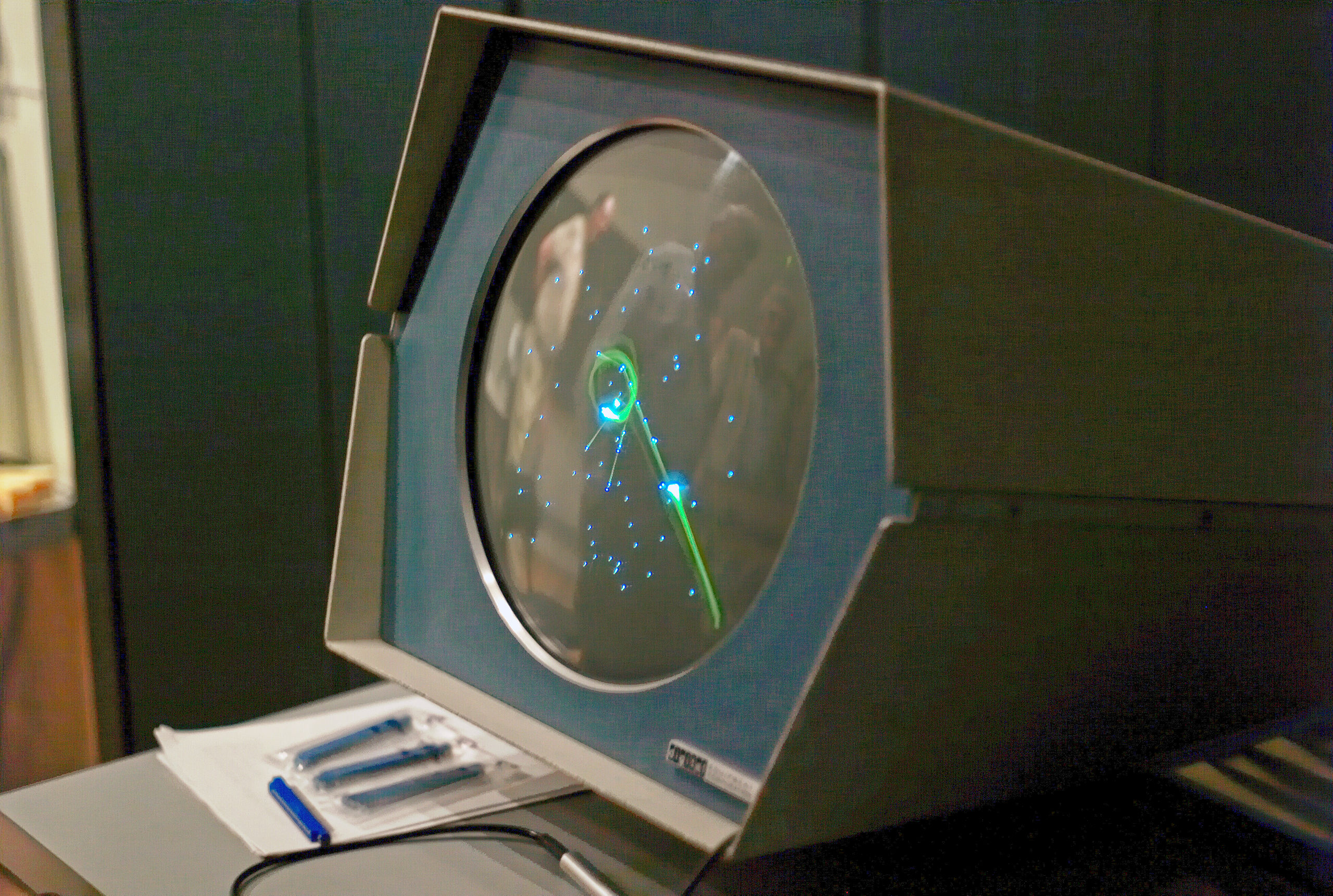
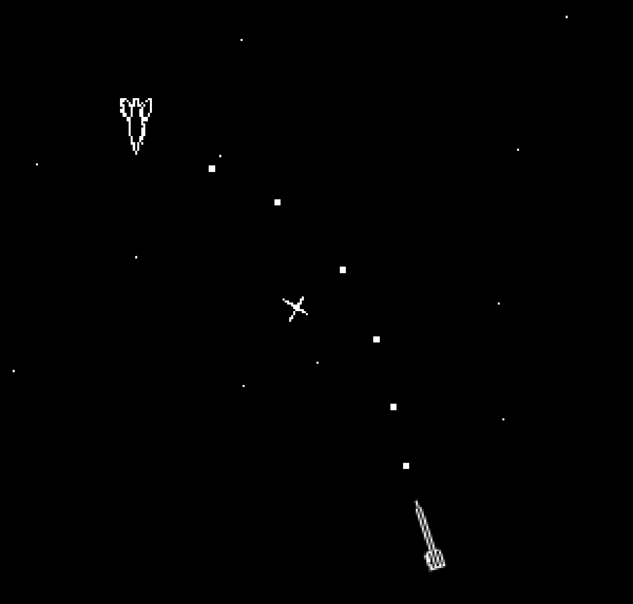
Img courtesy of https://en.wikipedia.org/wiki/Spacewar_(video_game)
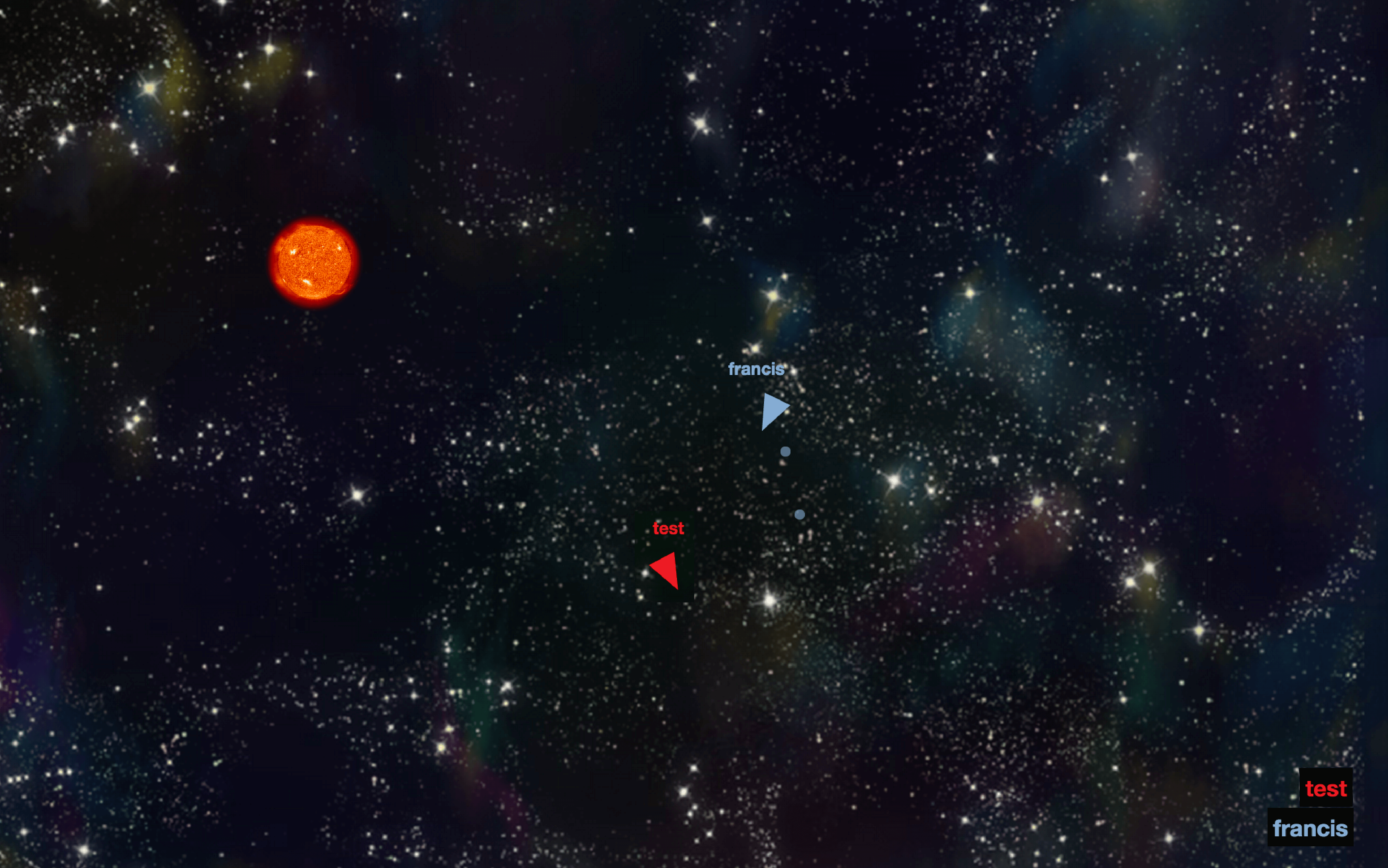
While this timeless rendition of Space Wars was originally designed for 2 players, my hackathon team and I decided to make this a much larger multiplayer experience at Facebook’s Regional Seattle Hackathon. Not only did we want to re-develop a browser version of the original, we wanted to see the ensuing chaos from having tens of players on screen. Utilizing Socket.IO’s support of web sockets, we connected up to 30 players concurrently at the hackathon. As one of the developers, I wrote the physics engine, helped on defining the packet protocol and some of the front-end work to render the spaceship shapes using HTML5 Canvas.
Process
Wanting to experiment with a new library at the time, we wrote a Node.js server to route a series of connections with web browsers via support from the JavaScript library Socket.IO. Socket.IO makes connection of web sockets remarkably easy, so we learned it pretty intuitively at the hackathon. Realizing we wouldn't have enough time to create a sprite sheet or use Unity, we employed HTML5 Canvas to draw the both the player and the bullets, and also built the physics and collision detection engines from scratch. In the time frame of the hackathon, we managed to create different game rooms via sessions, as well as implementing secure web sockets.
Whenever the player inputs navigation (arrow keys) or fires a bullet (spacebar), the web browser sends the server the throttled value of the key-press event. The server then processes the data and updates a “master” version of the game stored on the server. It then sends updates to each of the players involved, in order to guarantee that gameplay is synchronous. While this entire process occurs, the local players' inputs are updated on their client in order to provide a seamless user experience when dealing with latency.
Future Work
Though our team thought we would just work on the game as a part of the hackathon, we briefly brainstormed a list of things we would do differently, or features to build out. One of the biggest was improving the latency issues that we had. While the game worked fine locally on the same network with a large number of players, it would run many times slower given users were geographically further apart. Therefore, the most important algorithm that we wanted to implement was lag compensation. Should time allow and one of us decides to pull the project out to continue working on, lag compensation would be at the top of the list.

Atlas of Me
Generating and presenting personalized spatial analogies to aid comprehension of unfamiliar measurements.
About
How often do you encounter measurements while reading online news articles or other text documents? Imagine that today you encounter an article that describes forest fires breaking out in Spain just 4.3 miles from a well-known city. The reporter informs you that the fires have already consumed 5,000 acres of land. The fire sounds close to the city, and destructive, but how close, and how much destruction? Can you really relate to these statistics?
Designers and journalists often try to create spatial analogies to address these problems in understanding: re-expressing unfamiliar measurements in terms of measurements that are more familiar to their user. For example, a reporter might mention 4.3 miles is the distance from the University of Washington to the Space Needle, however if you are not familiar with Seattle, you will have no idea what these benchmarks mean! This is because our experience of space is individualized.
To scale spatial measurement analogies to each individual person, I helped develop a chrome extension, Atlas of Me. It generates spatial analogies for a user based on an address that they specify. The extension identifies measurements and country measurement, and provides the spatial analogy when the user clicks on any particular measurement. As one of the researchers on the project, I collaborated with Yeaseul Kim and Jessica Hullman to implement our Flask backend API and chrome extension interface.
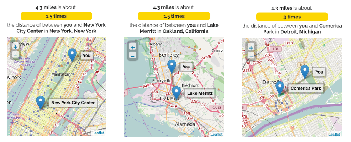
Distance analogies for a user in New York City, Berkeley CA, and Detroit MI.
How People Experience Space
To design Atlas of Me, we had to understand what makes spatial analogies useful. Through consulting research on the psychology of space, known as cognitive cartography: the study of how we experience and build mental models of spatial information. The work indicates the importance of landmarks necessary since we rely on them for for orienting and navigating in space.
To form the set of landmarks generally significant to users, we scraped around 240,000 locations through Yelps API. This gave us names and latitude and longitudes of locations which provides distance landmarks for us, landmarks used to generate distance analogies, say 4.3 miles or 800km. For area analogies, we decided to focus on other types of landmarks: public parks, campgrounds, botanical gardens, arenas and stadiums from our Yelp dataset. We also added US States as many US citizens have some understanding of their own state and surrounding states in terms of area.

U.S. maps depicting all landmarks (left) and area landmarks(right) in our dataset.
Visualizing the Analogies
Finally, after aggregating all of our distance and area landmarks, we present the best analogy for each measurement and location that Atlas parses in an article. In order for the user to contextualize their distance analogy, we display the submitted location of the user and the selected landmark. For the distance analogies, we decided to use Leaflet to generate the map. This allows us to use our predefined latitude and longitude locations that were scraped via the Yelp API. For our area analogies, we present the landmark’s area and polygon using D3.js.

A text article containing a distance, alongside three personalized spatial analogies generated by for a user in San Jose, Seattle, and Chicago
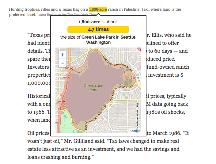
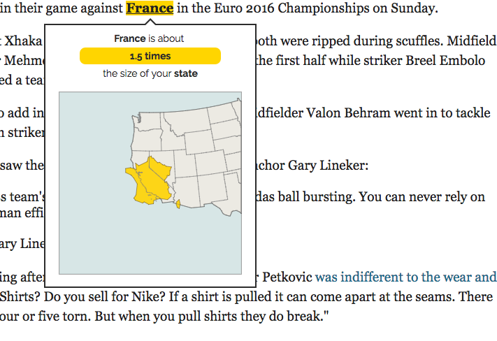
An area analogy reexpressing 1,600-acre for a user in Seattle and an area analogy of France for a user in California. The area of France is reexpressed in terms of the area of the user’s state.

Fridgit
Designing a solution to food waste and energy conservation, allowing users to make better decisions with how they store and use food.
About
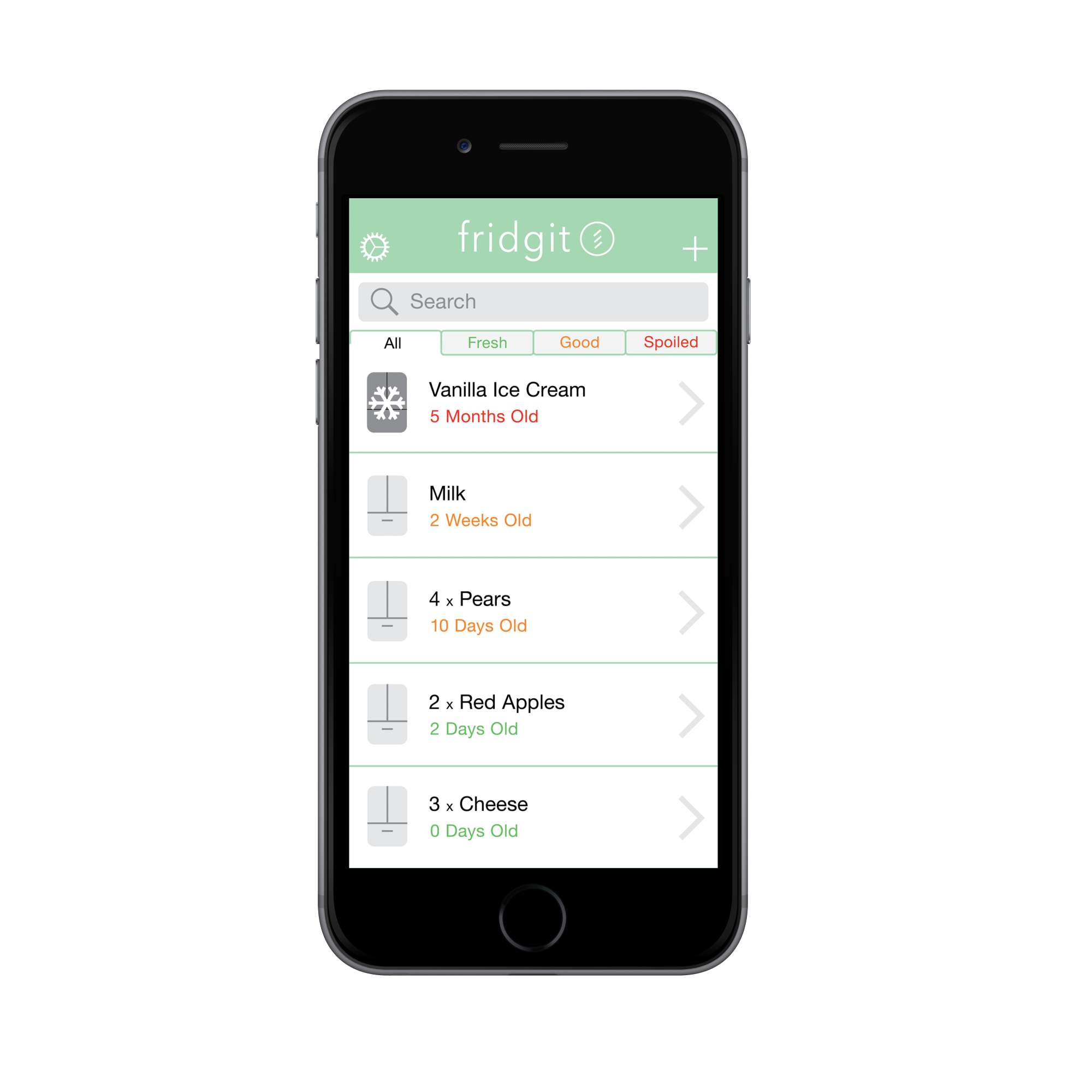
Fridgit is a smart refrigerator and companion mobile app designed to assist users reduce their food waste and encourage them to make responsible decisions about the foods they have. Fridgit is a project built for a computer science HCI class at UW where my group and I were tasked with designing a solution to food waste.
Having never formally learned the iterative design process before, I used the class as an initial foray into the field of human centered design, where I focused on user research, visual design, and UI engineering. I designed various concepts and visual content for the project and helped lead the other members of my group through the design process. I worked alongside three computer science students who were all interested in learning more about design.

Problem
According to Natural Resources Defence Council, 40 percent of food in the United States today goes uneaten. Americans throw out the equivalent of $165 billion each year. This includes leftovers getting spoiled, fresh produce and other processed goods. Many people usually forget about the foods that they have, don’t know much about proper food storage, or end up buying too much food to consume themselves.
After some initial research and digging around, we found that American households waste around 25 percent of the food products they buy. Many people usually forget about the foods that they have, don’t know much about proper food storage, or end up buying too much food to consume themselves.
Process
Without much understanding of the knowledge of food storage and food waste in households, we interviewed students and young working professionals and performed contextual inquiries in their homes to get a better idea of their needs, concerns, and problems. This proved extremely informative, as each provided us access to their refrigerators and food shelves, walking through them with us and describing their thoughts behind each food item.
We had each user answer a semi-structured interview to see what kind of problems they were already thinking of and to see if we could dig up any underlying assumptions in how they viewed the problem of food waste. We asked questions of how often they threw out food, and for what reason. We asked for walkthroughs of their pantry and the schedule of an average week of eating, cooking and storing food.
We discovered some key themes behind food storage and food waste: users are forgetful of their current inventory and often buy food they already had, users are generally uneducated regarding food storage, and are unsure of how long food can keep without spoiling. We identified this as a intention-behaviour gap; people don’t intend to waste food, but a mixture of forgetfulness and context made them waste food. We used these insights to design our app and fridge mechanics.
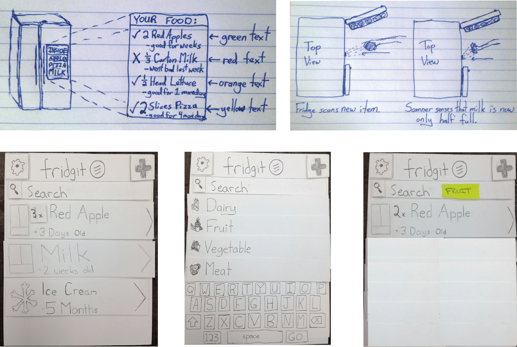
Sketches, storyboards, initial paper prototypes
How it works
Two internal cameras and weight sensors are used inside the Fridgit to dynamically update its inventory on an embedded computer. Fridgit also tracks how long food items have been in the fridge, how long they have until they spoil, food usage statistics, and features a manual add feature when adding leftovers or take-out foods. The companion app auto-updates a shopping list of food items when Fridgit notices that you’re running out of a particular food.
Final Product


Health Indicator Report
Analyzing and visualizing a dataset with R and D3.js to explore questions about Urbanization and Health Indicators in various countries.
Mortality rates, access to affordable healthcare, gross national income (GNI), and the enrollment rates of tertiary education facilities are very important to the welfare of a state, but how much do these indicators vary in developed versus developing nations? Working on this project with 3 other students, we chose to investigate this question further by looking at data from the World Databank. Specifically, data was gathered from 10 different countries - 5 developed and 5 developing, and we tracked 9 indicators, including Total Urban/Rural population, mortality rates, and GNI.
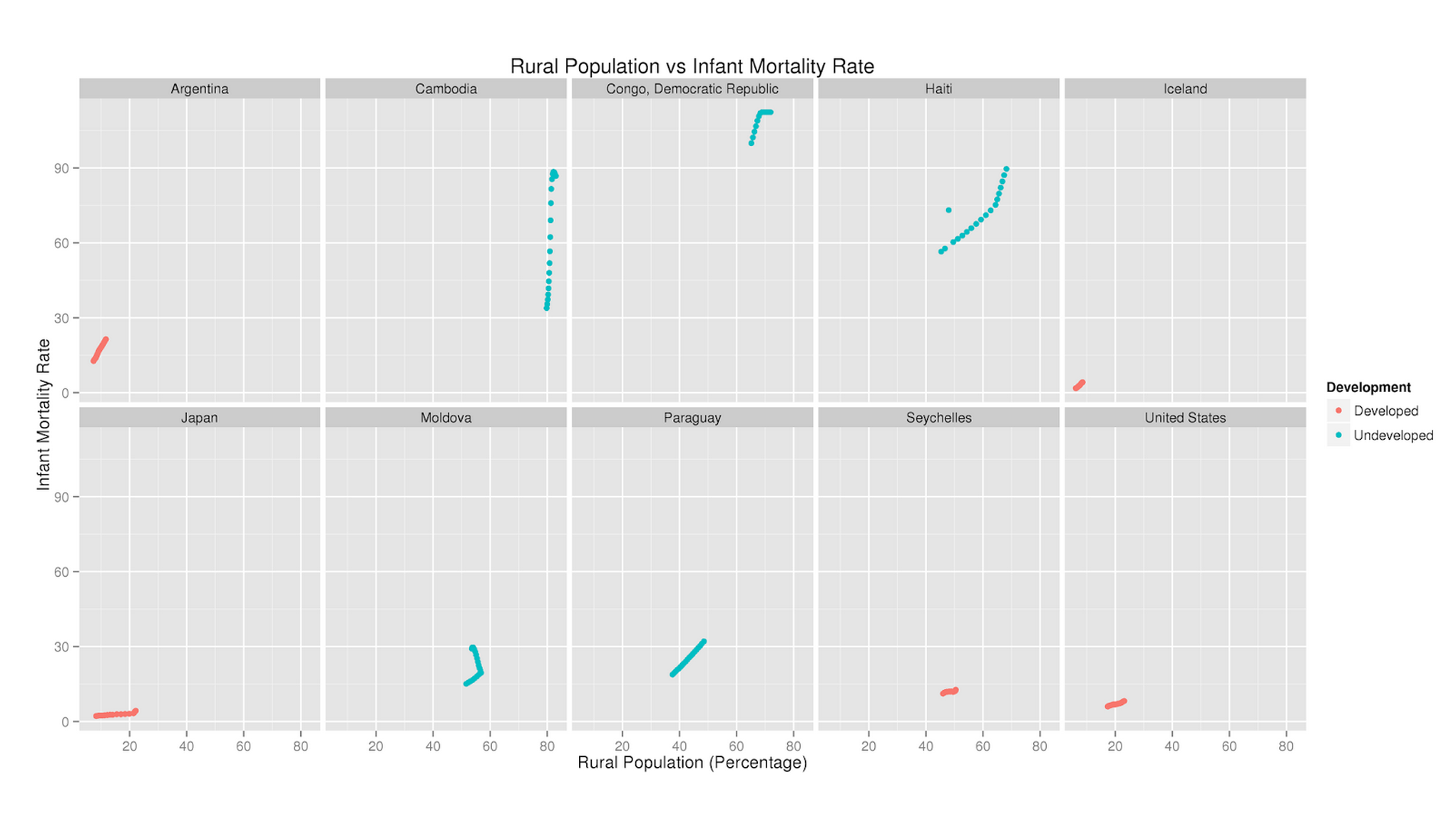
When first coming across the massive dataset, the first thing on the agenda was to get comfortable with the data. It was crucial to know what data was missing, which indicators were necessary, and how to approach the data. We proceeded to scrub the data of null values as they would affect statistical tests, and organized the data into separate CSV files for each country and into one large master dataset. I imported them all into R to run both general statistical summaries and correlation tests. We then took each of the indicators and plotted the correlation matrices between each of them.
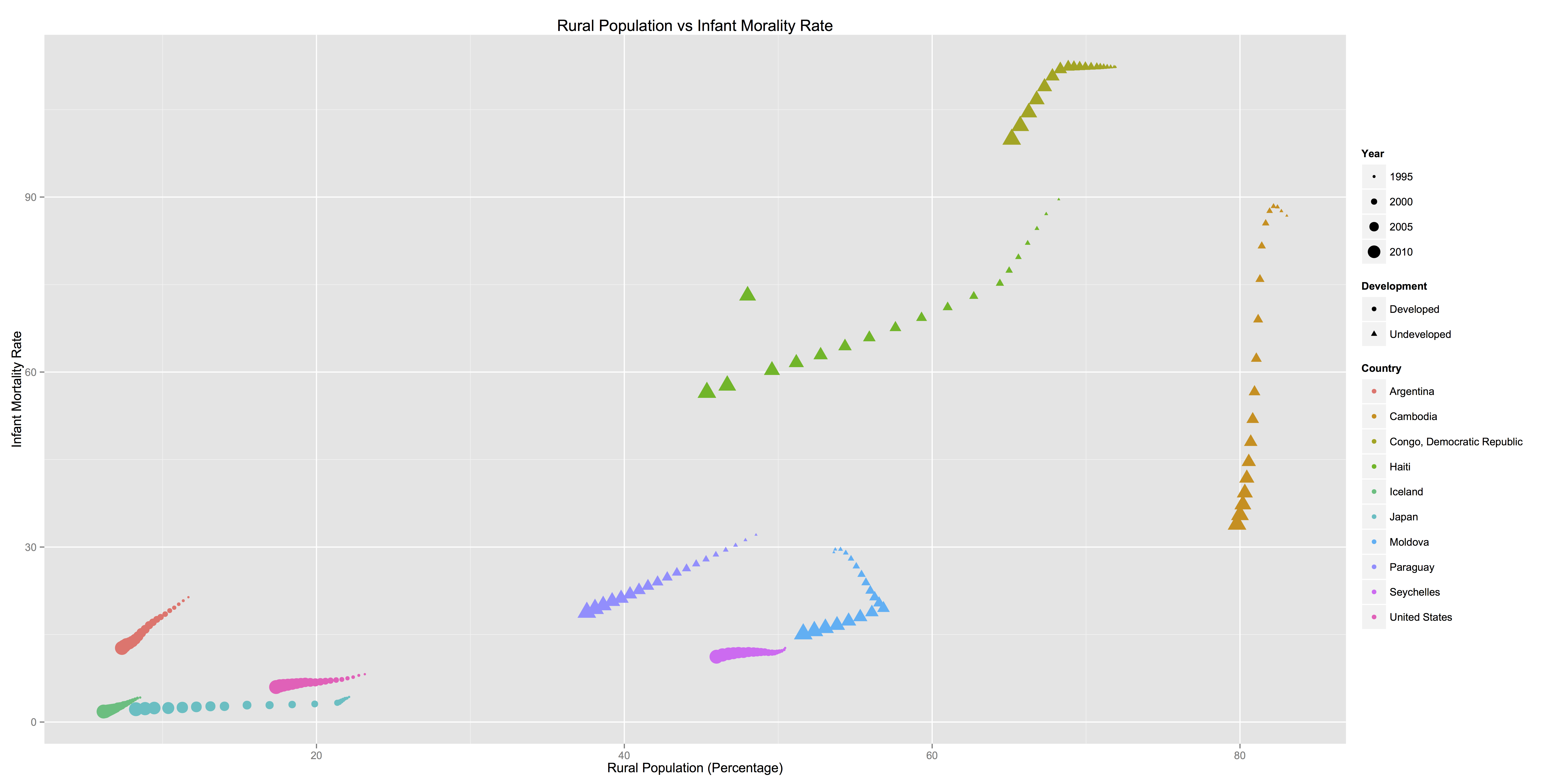
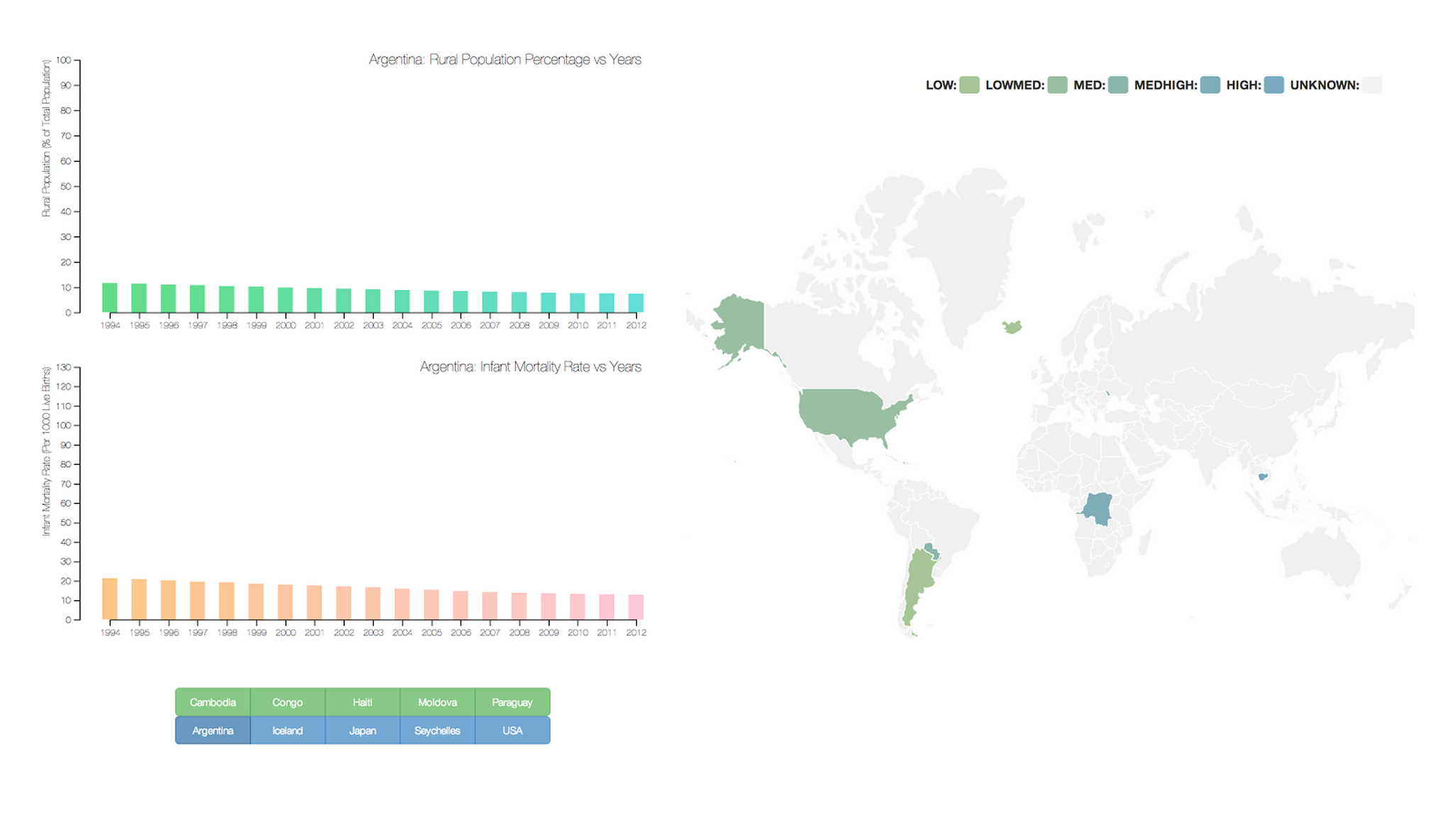
For the rendering of initial exploratory charts, I found that keeping the relevant countries in a master dataset was a more effective method for generating charts. By adding extra contextual information like the country name as well as whether it was developed or undeveloped, it was easier to visualize the categorical differences in the data. Eventually, in an attempt to make the data exploration more accessible to viewers, I created interactive charts that could be viewed online using D3.js.


Health Indicator Report
Analyzing and visualizing a dataset with R and D3.js to explore questions about Urbanization and Health Indicators in various countries.
Mortality rates, access to affordable healthcare, gross national income (GNI), and the enrollment rates of tertiary education facilities are very important to the welfare of a state, but how much do these indicators vary in developed versus developing nations? Working on this project with 3 other students, we chose to investigate this question further by looking at data from the World Databank. Specifically, data was gathered from 10 different countries - 5 developed and 5 developing, and we tracked 9 indicators, including Total Urban/Rural population, mortality rates, and GNI.
When first coming across the massive dataset, the first thing on the agenda was to get comfortable with the data. It was crucial to know what data was missing, which indicators were necessary, and how to approach the data. We proceeded to scrub the data of null values as they would affect statistical tests, and organized the data into separate CSV files for each country and into one large master dataset. I imported them all into R to run both general statistical summaries and correlation tests. We then took each of the indicators and plotted the correlation matrices between each of them.


For the rendering of initial exploratory charts, I found that keeping the relevant countries in a master dataset was a more effective method for generating charts. By adding extra contextual information like the country name as well as whether it was developed or undeveloped, it was easier to visualize the categorical differences in the data. Eventually, in an attempt to make the data exploration more accessible to viewers, I created interactive charts that could be viewed online using D3.js.


Exploring the Effects of Aggregation Choices on Untrained Visualization Users' Generalizations from Data
Results of two controlled experiments comparing the effects of aggregation choices on conclusions untrained users make.
Authors
Francis Nguyen, Xiaoli Qiao, Jeffrey Heer, Jessica Hullman
Venue
Computer Graphics Forum 2020
More At
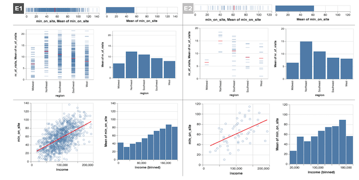
Visualization system designers must decide whether and how to aggregate data by default. Aggregating distributional information in a single summary mark like a mean or sum simplifies interpretation, but may lead untrained users to overlook distributional features. We ask, How are the conclusions drawn by untrained visualization users affected by aggregation strategy?
We present two controlled experiments comparing generalizations of a population that untrained users made from visualizations that summarized either a 1000 record or 50 record sample with either single mean summary mark, a disaggregated view with one mark per observation, or a view overlaying a mean summary mark atop a disaggregated view. While we observe no reliable effect of aggregation strategy on generalization accuracy at either sample size, users of purely disaggregated views were slightly less confident in their generalizations on average than users whose views show a single mean summary mark, and less likely to engage in dichotomous thinking about effects as either present or absent. Comparing results from 1000 record to 50 record dataset, we see a considerably larger decrease in the number of generalizations produced and reported confidence in generalizations among viewers who saw disaggregated data relative to those who saw only mean summary marks.


For the rendering of initial exploratory charts, I found that keeping the relevant countries in a master dataset was a more effective method for generating charts. By adding extra contextual information like the country name as well as whether it was developed or undeveloped, it was easier to visualize the categorical differences in the data. Eventually, in an attempt to make the data exploration more accessible to viewers, I created interactive charts that could be viewed online using D3.js.


Health Indicator Report
Analyzing and visualizing a dataset with R and D3.js to explore questions about Urbanization and Health Indicators in various countries.
Mortality rates, access to affordable healthcare, gross national income (GNI), and the enrollment rates of tertiary education facilities are very important to the welfare of a state, but how much do these indicators vary in developed versus developing nations? Working on this project with 3 other students, we chose to investigate this question further by looking at data from the World Databank. Specifically, data was gathered from 10 different countries - 5 developed and 5 developing, and we tracked 9 indicators, including Total Urban/Rural population, mortality rates, and GNI.
When first coming across the massive dataset, the first thing on the agenda was to get comfortable with the data. It was crucial to know what data was missing, which indicators were necessary, and how to approach the data. We proceeded to scrub the data of null values as they would affect statistical tests, and organized the data into separate CSV files for each country and into one large master dataset. I imported them all into R to run both general statistical summaries and correlation tests. We then took each of the indicators and plotted the correlation matrices between each of them.


For the rendering of initial exploratory charts, I found that keeping the relevant countries in a master dataset was a more effective method for generating charts. By adding extra contextual information like the country name as well as whether it was developed or undeveloped, it was easier to visualize the categorical differences in the data. Eventually, in an attempt to make the data exploration more accessible to viewers, I created interactive charts that could be viewed online using D3.js.


Health Indicator Report
Analyzing and visualizing a dataset with R and D3.js to explore questions about Urbanization and Health Indicators in various countries.
Mortality rates, access to affordable healthcare, gross national income (GNI), and the enrollment rates of tertiary education facilities are very important to the welfare of a state, but how much do these indicators vary in developed versus developing nations? Working on this project with 3 other students, we chose to investigate this question further by looking at data from the World Databank. Specifically, data was gathered from 10 different countries - 5 developed and 5 developing, and we tracked 9 indicators, including Total Urban/Rural population, mortality rates, and GNI.
When first coming across the massive dataset, the first thing on the agenda was to get comfortable with the data. It was crucial to know what data was missing, which indicators were necessary, and how to approach the data. We proceeded to scrub the data of null values as they would affect statistical tests, and organized the data into separate CSV files for each country and into one large master dataset. I imported them all into R to run both general statistical summaries and correlation tests. We then took each of the indicators and plotted the correlation matrices between each of them.


For the rendering of initial exploratory charts, I found that keeping the relevant countries in a master dataset was a more effective method for generating charts. By adding extra contextual information like the country name as well as whether it was developed or undeveloped, it was easier to visualize the categorical differences in the data. Eventually, in an attempt to make the data exploration more accessible to viewers, I created interactive charts that could be viewed online using D3.js.


Improving Comprehension of Measurements Using Concrete Re-expression Strategies
A collection of tools to take unfamiliar measurements and re-express them in terms of more familiar objects.
People frequently encounter measurements when interacting with digital media. A news article might describe how much a fragment of meteorite discovered on a beach weights (50.3 grams). A data visualization might compare the average amount of daily water use per person in multiple countries (20 to 205 gallons). People often struggle to grasp the quantity that such measurements refer to, limiting their comprehension.
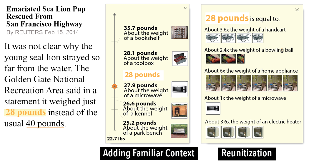
Educators and journalists often re-express unfamiliar measurements in terms of more familiar objects (50.3 grams is about the weight of a golf ball). But this requires time and effort. We present a set of tools for automatially creating concrete measurement re-expressions using familiar objects.


We present automated algorithms that enact three strategies used by educators and journalists to make unfamiliar measurements more understandable:
- Adding Familiar Context: Presents a measurement (e.g., 28 lbs) alongside objects with similar measurements (e.g., the weight of a tool box, the weight of a microwave).
- Reunitization: Re-expresses a measurement (e.g., 3 ft) using a more familiar object as the unit with a multiplicative scale factor for converting from one to the other (e.g., 2 times the height of a single bed).
- Proportional Analogy: Re-expresses a pair of measurements (e.g., the ratio between the volumes of Mercury and Earth) using two familiar objects that have measurements with the same ratio (e.g., the ratio between the volume of a sugar bowl and a watering can)
Our algorithms quantify criteria of effective re-expressions:
- Measure Variance: The measured property of the object should not vary greatly between instances of the object so that people can reliably estimate the measurement.
- Measure Closeness: The measured property of the object should be close to the unfamiliar input measurement so that people can mentally convert from the measurement of the familiar object to the unfamiliar measurement.
- Object-Measure Familiarity: The object and its measured property should be familiar to people based on experience.

